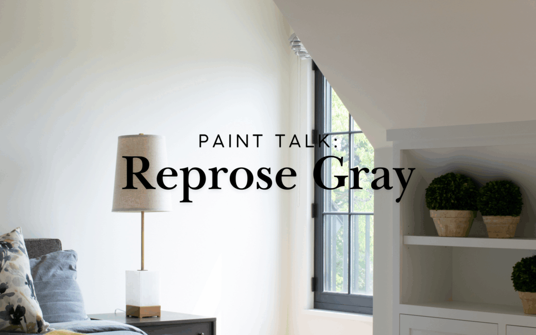
Listen, I've painted a lot of rooms. And if there's one color that keeps showing up in my paint bucket, in your Pinterest boards, and in nearly every home I walk into—it's Repose Gray.
So what's the deal? Why does everyone from first-time DIYers to custom home builders keep reaching for this exact shade?
Let me walk you through it.
What Does Repose Gray Actually Look Like in Real Life?
Here's the truth: Repose Gray is that friend who gets along with everyone at the party.
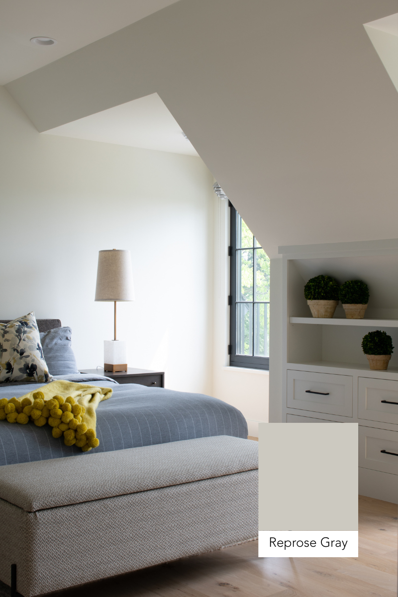
Imagine walking into a room and feeling like you can actually breathe. Not boring-hotel-beige breathe. Not cold-dentist-office breathe. Just... calm. Welcoming. Like the walls are giving you a hug without trying too hard.
That's Repose Gray.
Most people call it a warm gray, but it's really playing in that perfect greige zone—where gray meets beige and they shake hands like old friends. You get just enough warmth from those subtle taupe undertones to keep things cozy, but it never tips into "my grandma's living room" territory.
Does Repose Gray Change Color Throughout the Day?
Oh yeah, and here's where it gets fun.
This color has a personality. On a bright, sunny morning? Repose Gray leans warmer, almost like it's soaking up the light and giving it back to you. It feels soft. Inviting. The kind of backdrop that makes your morning coffee taste better.
But when evening rolls around or you flip on those LED lights? You might catch hints of violet or blue peeking through. Don't panic—it's not going full-on cold gray on you. It's just adapting. Being flexible. Keeping your space interesting without being dramatic about it.
That's the magic of good paint. It works with your life, not against it.
Is Repose Gray Good for Every Room?
Short answer? Yes.
Longer answer? Hell yes.
We've used Repose Gray in bedrooms where people need to actually sleep. Living rooms where families gather and life happens. Home offices where you need to focus without feeling like you're in a jail cell. Even bathrooms and hallways.
Here's why it works everywhere:
It plays well with everything. Got dark wood floors? Great. White trim? Perfect. Bold furniture? Even better. Repose Gray is the ultimate team player. It lets your stuff shine without competing for attention.
It's never boring. Those undertones I mentioned? They keep things interesting. Your walls won't just sit there doing nothing. They'll shift subtly with the light, the time of day, and your mood. It's like having a color that actually listens to your space.
It connects rooms without being matchy-matchy. Want a consistent flow through your whole house? Repose Gray gives you that thread that ties everything together, but each room still gets to have its own vibe.
Who Should Choose Repose Gray?
Real talk: If you've been staring at paint chips for three weeks and can't decide, Repose Gray is your answer.
Pick this color if you:
- Want something that feels current but won't look dated in two years
- Need a neutral that's actually neutral (not secretly pink or unexpectedly purple)
- Love the idea of one color flowing through multiple rooms
- Want your furniture and decor to be the stars of the show
- Appreciate warmth, but don't want traditional beige
Skip it if you:
- Love bold, saturated color on every wall
- Want something with more drama or contrast
- Prefer true cool grays without any warmth
How Do I Make Repose Gray Work in My Home?
Ready to make this happen? Here's what I tell every homeowner:
Test it first. I know, I know—you've heard this a million times. But grab a sample. Paint a big section. Live with it for a few days. Watch it in morning light, afternoon light, evening light. Make sure you two are compatible before you commit to the whole room.
Pay attention to your lighting. North-facing rooms? You'll see more of those cool undertones. South-facing with tons of sun? The warmth will really shine. It's not a dealbreaker either way, just something to notice.
Don't be scared to go all in. This color works beautifully when you paint trim, walls, and even ceilings all in Repose Gray. It creates this cohesive, wrapped-up-in-a-blanket feeling that's surprisingly sophisticated.
What Colors Go With Repose Gray?
Everything. Seriously.
Pair it with crisp whites for a fresh, modern look. Layer in warm woods and natural textures for that cozy farmhouse vibe. Throw in pops of navy, emerald, or even blush pink, Repose Gray handles it all like a champ.
The beauty is that it's neutral enough to be your foundation, but interesting enough that you're not starting from zero when you decorate.
Ready to Transform Your Space?
Look, here's what I know after years of painting homes across Minneapolis: the right color changes everything. Not just how a room looks, but how it feels. How you feel walking into it every single day.
Repose Gray has earned its reputation because it delivers. It's the color that makes homeowners text me six months later saying, "I love walking into my house now."
That's what we're after, right? A home that feels like yours. Where you can kick off your shoes, sprawl on the couch, and think, "Yeah. This is it."
Want to see what Repose Gray could do for your home? Let's talk. Whether you're tackling one room or reimagining your whole main floor, we'll help you nail the color, the finish, and the execution. Because the right paint job isn't just about covering walls—it's about creating a space you'll love for years.
Stop pinning. Start doing. Your walls are waiting.
And, if you need help, we can help.