Color has a profound impact on our psychological well-being and the perceived ambiance of a space. This is particularly true in the context of interior design and home construction, where paint choices can transform a room from stark and impersonal to warm and inviting. The way different colors interact with each other in a space can evoke a delightful symphony of emotions or, more unfortunately, a discordant cacophony that few would find relaxing.
For luxury homeowners, builders, remodelers, and interior designers, the selection of paint colors is akin to orchestrating a grand concert; harmonious combinations can imbue a home with an elegant, soothing atmosphere. In this comprehensive guide, we will explore the synergy between selected Benjamin Moore and Sherwin Williams paint colors such as White Dove, Black Panther, Kendall Charcoal, and Repose Gray. The aim is to not only showcase their strengths but also reveal how they can collaborate to create spellbinding interiors.
The centerpiece of the renovation is undoubtedly the fireplace, which we chose to give a distinctive makeover. Opting for a black moire specialty finish, the texture adds a layer of sophistication and depth to the room's focal point. This finish not only elevates the fireplace's aesthetic but also creates a mesmerizing effect as the light dances across its surface. Complementing this striking finish, we installed a beautiful wood mantel above. This mantel, crafted from high-quality wood, adds a touch of warmth and natural charm, creating a perfect contrast to the fireplace's modern and sleek look. Together, these elements combine to create a fireplace that is not only a source of warmth but also a significant design statement, anchoring the room's overall decor and ambiance.

The Psychology Behind Paint
Before we pick up that roller, it is critical to understand the basic principles of how color works and why certain shades resonate more than others. Humans have an inherent connection with color, and different hues can evoke a spectrum of emotions.
The concept of warm and cool colors is fundamental — warm colors like reds, oranges, and yellows are often associated with energy and comfort, while cool colors such as blues, greens, and purples tend to have a calming effect. The balance between these can determine the overall "feel" of a room.
Color can also trick the eye. Darker shades tend to make a space feel smaller and cozier, while lighter tones open up a room and provide a sense of spaciousness. This interplay of light and dark can be pivotal in interior design to create areas of focus and accentuate architectural features.
Certain paint colors have become synonymous with great design due to their versatility and consistent appeal across different aesthetics.
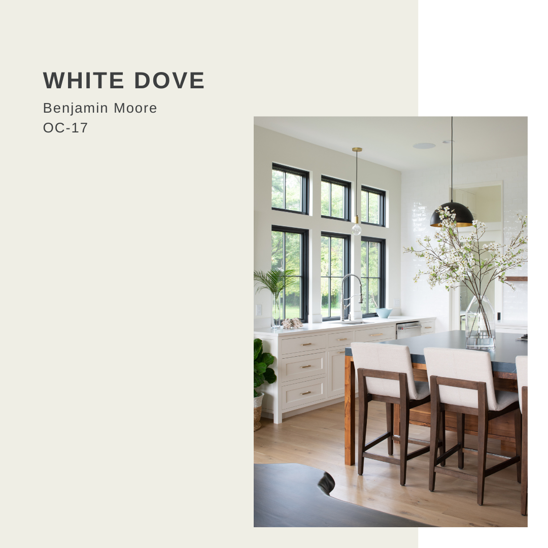
Benjamin Moore's White Dove
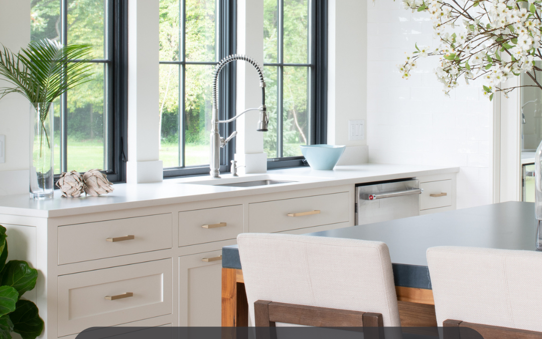
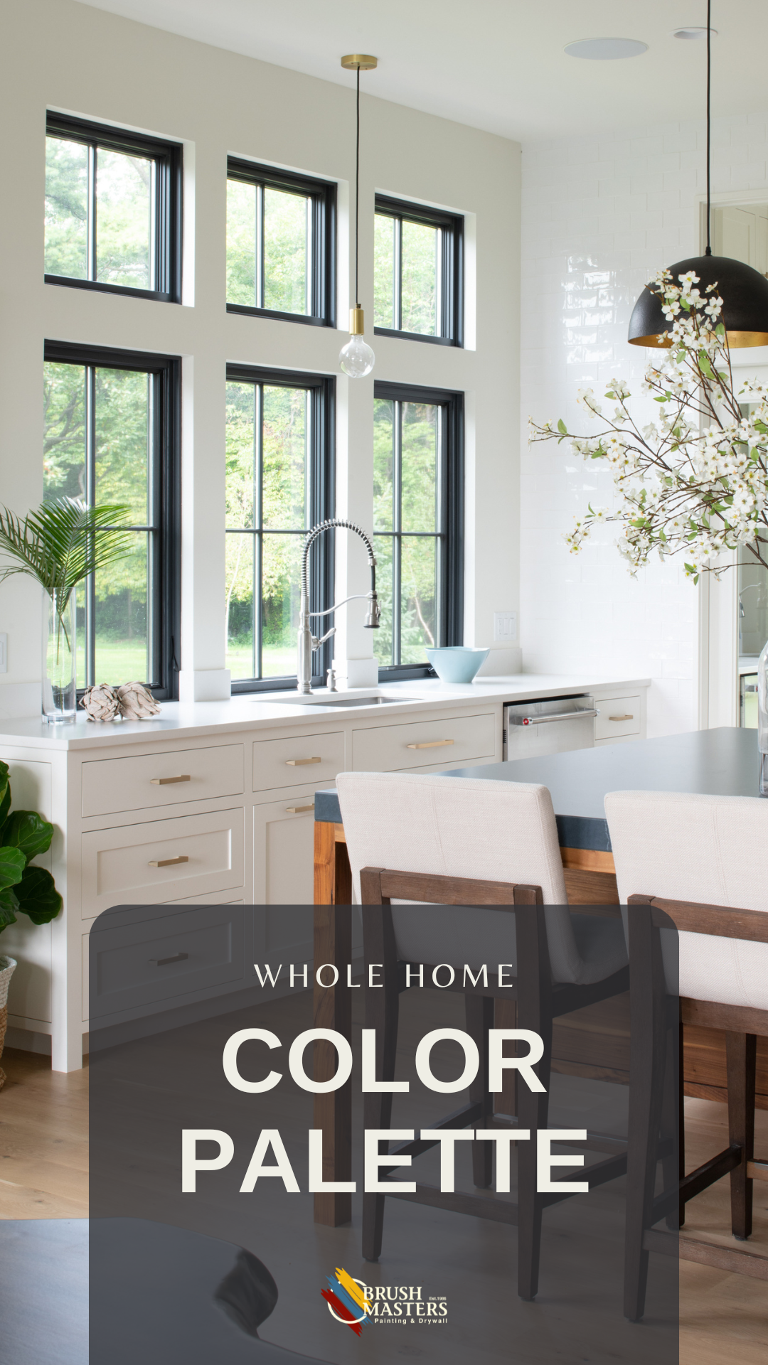
White Dove by Benjamin Moore is a go-to white for many designers and homeowners, offering a soft, warm, and welcoming hue that never feels stark. It's an excellent choice for trim work, ceilings, and walls alike, particularly in rooms that receive ample natural light.
Sherwin Williams' Repose Gray
Repose Gray from Sherwin Williams is a contemporary, warm gray that adapts well to a variety of lighting conditions. Its ability to shift between warm and cool tones means it can complement both beiges and whites, making it a perfect transitional color.
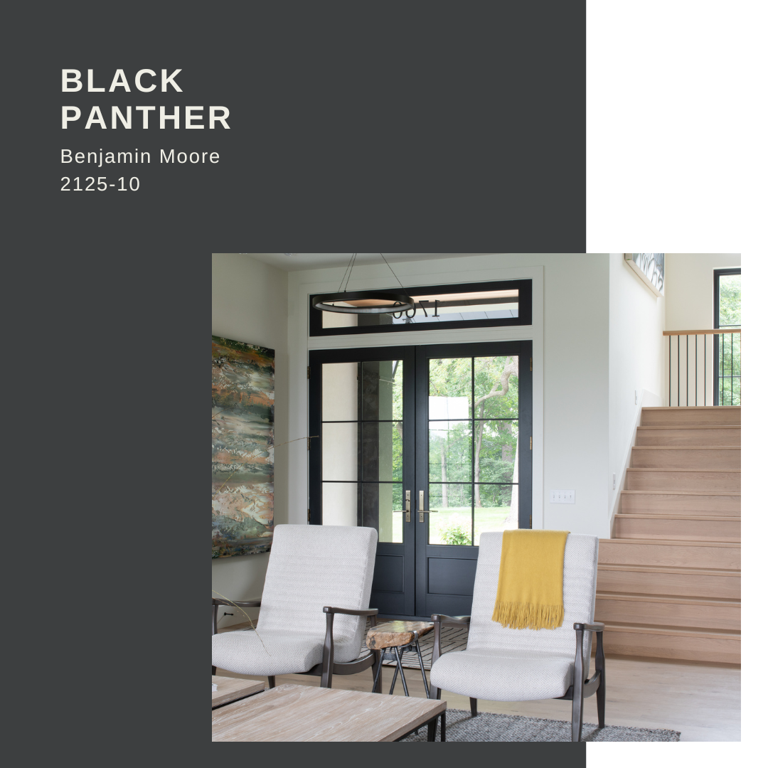
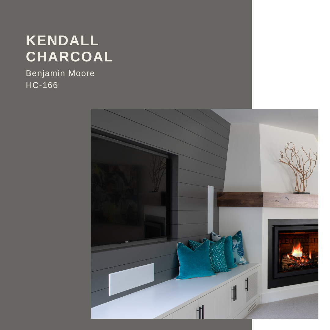
Benjamin Moore's Black Panther and Kendell Charcoal
These strong, dark colors can boundary with bold, dramatic effects. Black Panther and Kendell Charcoal provide depth and sophistication, and when used strategically — such as in accent walls or on cabinetry — they can add a touch of urban luxury to any room.
Creating a Color Palette
When designing interiors, it’s not just about picking one color but about creating a palette that resonates. A solid palette typically includes a neutral base, a color for accents, and one or two additional colors for variety.
Primary Color - Start with the color that will be the most dominant in the room. This can be a neutral or a more vibrant shade, depending on the desired effect.
Accent colors should be used sparingly to highlight features or create a focal point. These can be complementary or contrasting to the primary color.
Supporting Colors - These are the rest of the colors in the room that provide a transition between the main color and the accents. They should flow naturally with no one color standing out too much.
Harmonizing Benjamin Moore and Sherwin Williams Paint Colors
For a harmonious home, it's essential to bring together colors that flow seamlessly from room to room. Here are a few potential combinations using our selected colors:
White Dove with Repose Gray
A combination that never goes out of style, White Dove and Repose Gray work beautifully together, creating a space that feels light and airy yet grounded.
Black Panther as an Accent
Introduce a touch of elegance with Black Panther. When used as an accent against White Dove, it stands out with bold sophistication. For a subtler approach, consider using Black Panther on interior doors and trim alongside Kendell Charcoal on cabinetry in a kitchen or bathroom.
Layering with Kendell Charcoal
Use Kendell Charcoal to create depth — pair it with Repose Gray in a bedroom for a serene yet substantial feel that's perfect for relaxation.
The Role of Light and Space
It’s essential to consider how lighting conditions and the size of a room will affect the perception of paint colors. Natural and artificial light can alter the appearance of a paint color significantly, so always test your paint in the space under different lighting before committing.
In small spaces, a lighter color scheme can help to visually expand the space, while in larger areas, deeper tones can create a more intimate environment. Always choose your palette with the room’s function in mind, as different shades can affect our behavior and mood.
Trending Color Schemes
Current trends in interior design are leaning towards more thoughtful use of color. Rather than one room with one bold color, designers are layering multiple tones to create nuanced, dynamic spaces.
Remember, trends are cyclical, and it’s better to focus on creating a timeless palette that you can personalize with seasonal and trend-driven accents as desired.
Additional Considerations for Premium Spaces
For luxury homeowners and those creating premium spaces, the selection and execution of paint color is pivotal. Here are some additional considerations:
- Do not shy away from high-gloss paints in spaces like the dining room or master bedroom to add a touch of opulence and reflectivity.
- Textured walls and specialist finishes can take a color scheme to the next level, providing depth and interest.
- Custom-mixed paints can offer a unique, one-of-a-kind color that speaks to the exclusivity of the space.
- Incorporate the paint color into the overall design theme, ensuring that all elements — from furniture to art — play harmoniously with the chosen hues.
Bringing Your Vision to Life
Ultimately, designing a harmonious space with colors like White Dove, Black Panther, Kendell Charcoal, and Repose Gray is an art form. It requires an understanding of color psychology, a keen eye for design, and the ability to skillfully mesh different elements.
Begin with a clear vision for the atmosphere you want to create, then experiment with different combinations to find what best brings that vision to life. Remember, while color can set the tone, the way you style and furnish the space will complete the narrative.
For those new to interior design, or even seasoned professionals, don't be afraid to seek out inspiration or consult with experts. With a thoughtful approach and a little experimentation, you can unlock the magic of paint color combinations and transform your home into a luxurious and welcoming retreat.